
My Trading Journey: From 2007 to Today – How Charts Became My Compass
17-08-2025

My Trading Journey: From 2007 to Today – How Charts Became My Compass
By Vikash Bagaria
2007 – The Beginning of a Trader
I entered the market in 2007 with excitement and curiosity. Everyone around me was talking about the “India growth story”. The Nifty was rising, enthusiasm was high, and I too believed that this was the place to build wealth.
But when I looked at the screens, the candlesticks, the moving averages, and the RSI—they looked like random lines. Yet something told me: these lines have secrets.
👉 What i Observed way back then:
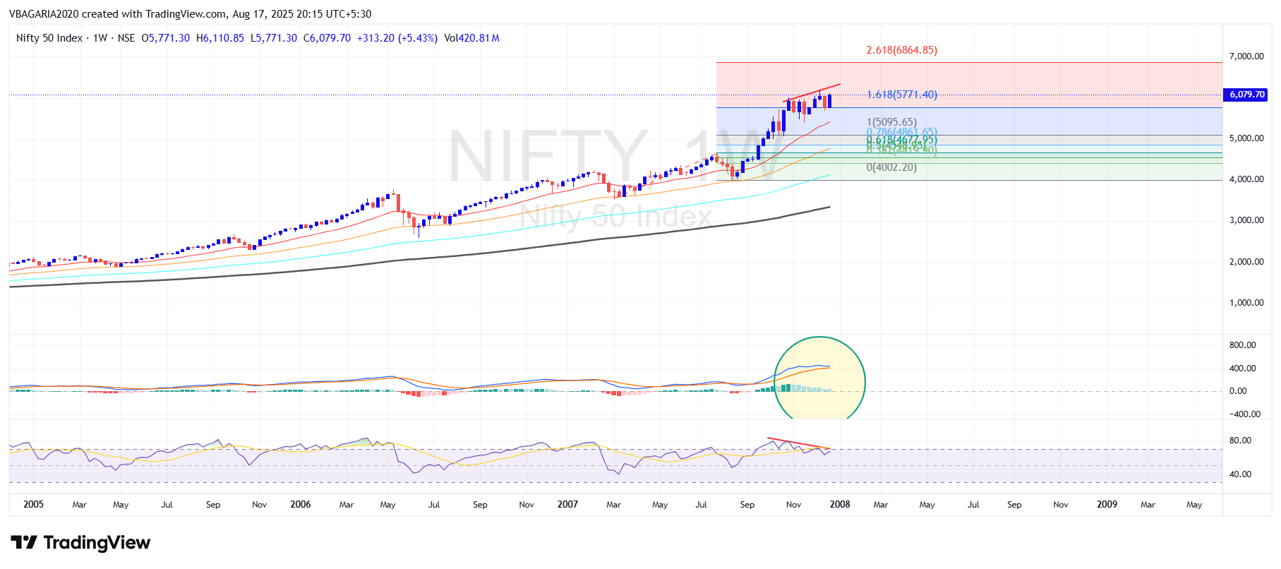
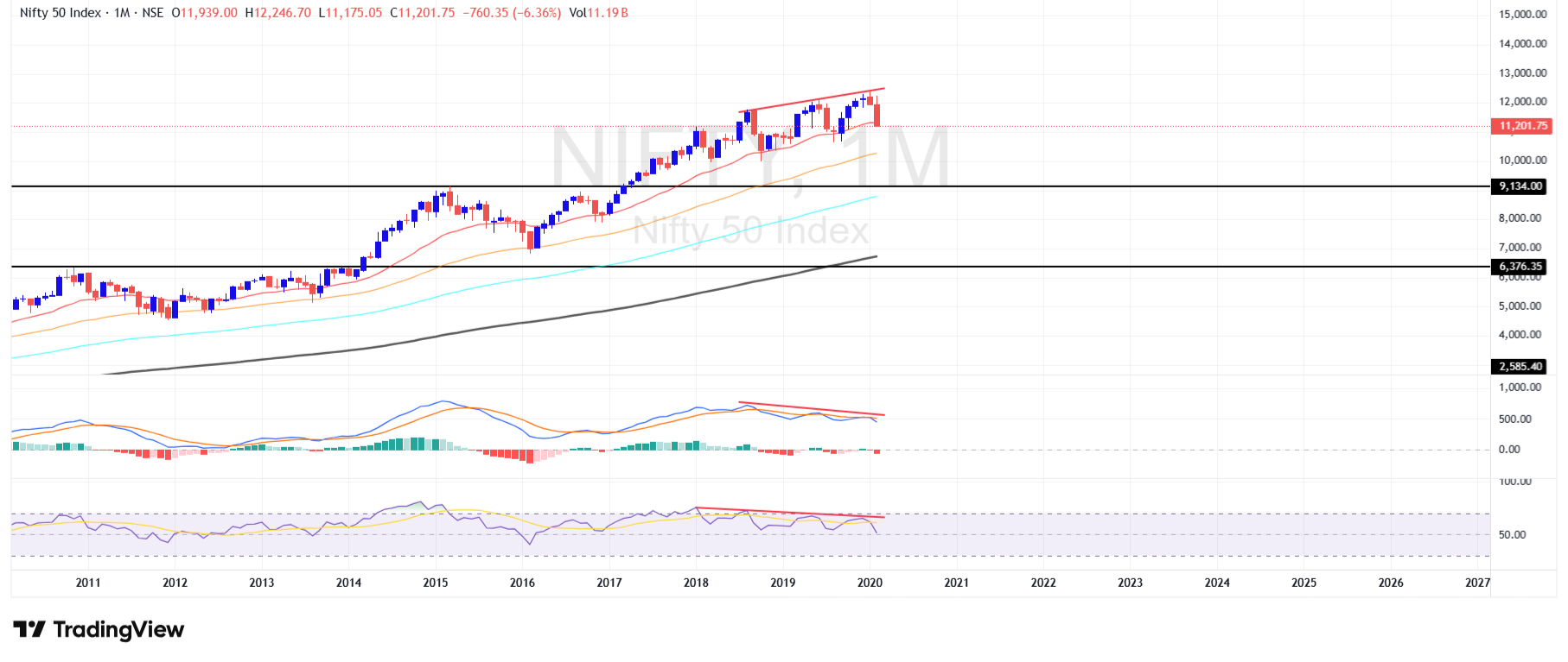
RSI Divergence: Price made fresh highs (above 6000), but RSI started forming lower highs. This clear bearish divergence meant momentum was weakening while prices kept rising.
MACD: The weekly MACD histogram showed fading momentum, and the MACD lines flattened out (as highlighted in your chart). This was a strong warning of exhaustion.
Fibonacci Extension: The Nifty rally from 4002 stopped exactly at the 1.618 Fibonacci extension

17-08-2025
2008 – The Lehman Brothers Collapse
Just a year later came my baptism by fire. Lehman Brothers collapsed. Global markets fell like dominoes, portfolios evaporated, and fear ruled the streets. Many quit the game. But for me, it was my first big realization: risk management is survival. And even more important—charts often give signals before the news.
What i Observed way back then:
After the massive rally of 2007, Nifty touched historic highs above 6000 in early 2008. Market sentiment was euphoric, everyone believed “India is unstoppable.”
But the charts were quietly telling a very different story.
Technical Insights (before the 2008 crash):
-
RSI Divergence: Price made fresh highs (above 6000), but RSI started forming lower highs. This clear bearish divergence meant momentum was weakening while prices kept rising.
-
MACD: The weekly MACD histogram showed fading momentum, and the MACD lines flattened out (as highlighted in your chart). This was a strong warning of exhaustion.
-
Fibonacci Extension: The Nifty rally from 4002 stopped exactly at the 1.618 Fibonacci extension – a natural resistance zone where major reversals often occur.
-
Candlestick Patterns: Near the top, indecision candles and Evening Star appeared, signaling profit booking and distribution.
-
Moving Averages: Prices had stretched far above the 20-week EMA, which historically leads to sharp mean reversion – and that’s exactly what followed during the crash.
So while the world was celebrating the “India Shining” story, the charts were already whispering: “The tide is turning.” And then Lehman Brothers’ collapse triggered the meltdown, dragging Nifty from 6000+ to below 2500.
"I also realized something powerful—while news arrives late, charts often show the story before the headlines."
18-08-2025
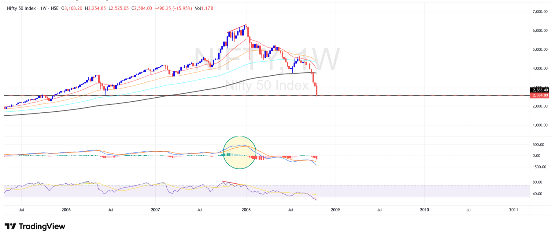
2009 – The Comeback Year
After the devastating fall of 2008, when Nifty dropped from above 6000 to nearly 2500, fear dominated the market. Investors had lost hope, and the global financial system was under pressure. But quietly, the charts started flashing signs of a bottom.
What i Observed way back then: (Why the 2009 Recovery Happened):
Double Bottom Formation: Around 2500, Nifty created a double bottom pattern (late 2008 and early 2009). This is one of the strongest reversal signals, suggesting heavy accumulation.
Hammer Candles: Weekly charts showed hammer candlesticks near the lows – a powerful sign that selling was being absorbed and buyers were stepping in.
RSI Oversold to Hidden Bullish Divergence: RSI had collapsed below 30 during the crash, but in early 2009 it formed a Hidden bullish divergence .This was an early clue that momentum was shifting upward.
MACD Bullish Crossover: The MACD lines, which had been negative all through the crash, finally gave a bullish crossover in early 2009 – confirming that the downtrend was losing steam.
20-Week EMA Reclaim: For the first time after months, Nifty closed back above the 20-week EMA, which acted like a green signal that the bear phase was ending.
When Nifty fell to around 2585, something remarkable happened:
This exact zone had acted as a major resistance in 2004–2005 (circled area).
This exact zone had acted as a major Support in 2006 (circled area).
In 2009, the same zone turned into a support base – a classic Change in Polarity (resistance becomes support).
Technical Insights:
Price Action: Nifty formed hammer candles and a double bottom right at the 2585 polarity zone ,showing buyers stepping in aggressively.
RSI Divergence: While price retested the lows, RSI created higher lows, signaling hidden strength.
MACD Crossover: Around the same zone, MACD gave a bullish crossover, confirming momentum shift.
EMA Respect: Price reclaimed the 20-week EMA for the first time after the crash, a green light for trend reversal.
What It Taught Me
Price remembers history: Old resistance becomes new support. 2585 wasn’t a random number; it was the market’s memory.
Trust polarity zones: While fear dominates the headlines, charts reveal where smart money is buying.
Polarity = Opportunity: Instead of panicking at the lows, I learnt to respect these zones and look for reversals.
2009 showed me the power of Change in Polarity: when a market respects its past price action, it gives birth to the next bull run.
18-08-2025
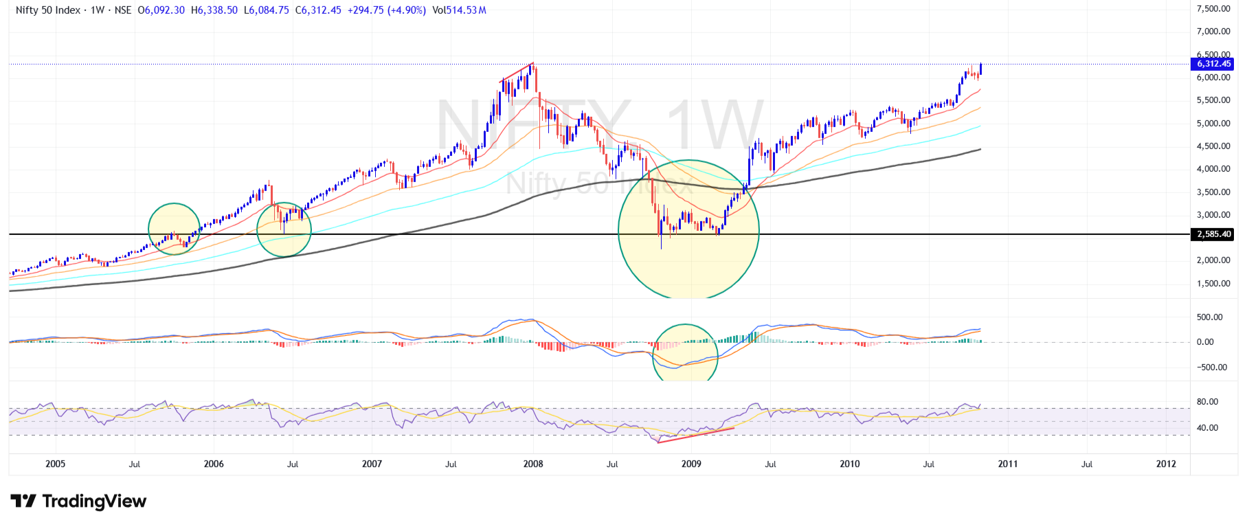
2014 – Modi’s Election Victory & The Indian Bull Run
The 2014 elections brought Narendra Modi to power, and with him came a wave of optimism. India entered a new bull run, and markets celebrated with historic highs. It was another reminder that politics and policies move markets, but technical analysis shows where the real momentum lies.
2014 was a historic turning point for Indian markets. Narendra Modi’s election win triggered massive optimism and a structural bull run. But technically, the stage had been set even before the results.
Price Action & Change of Polarity
-
Old Resistance Zone: For years, the Nifty struggled around the 6100–6300 zone (2008 & 2010 highs). Every attempt to cross this level failed, making it a strong ceiling.
-
Change of Polarity: In 2014, Nifty finally broke above this resistance with a powerful rally. The same 6100–6300 zone, which had been a cap for 6 years, flipped into a support base – a Vikash bagaria`s Change of Polarity Zone.
-
Cup & Handle Breakout: The multi-year consolidation (2008–2013) created a Cup & Handle pattern, and 2014 elections provided the breakout trigger.
-
Volume Confirmation: The breakout happened with massive volumes, proving strong institutional buying.
-
Momentum Indicators:
-
RSI surged above 70 (entering bullish territory).
-
MACD gave a clean bullish crossover above the zero line, confirming a long-term trend shift.
-
-
Moving Averages: Price reclaimed and rode above the 50-week and 200-week EMAs – a structural confirmation of a new bull market.
What It Taught Me
-
Consolidation builds power: The longer the consolidation (6 years around 6300), the stronger the breakout.
-
Change of Polarity is the key: Once the old resistance flipped into support, the market never looked back – every dip was bought.
-
Patterns + Fundamentals = Magic: The Cup & Handle breakout aligned with a major political shift, proving that charts often prepare before events unfold.
2014 taught me that big breakouts are born at polarity zones, and when price, volume, and sentiment align – a new cycle begins.
18-08-2025
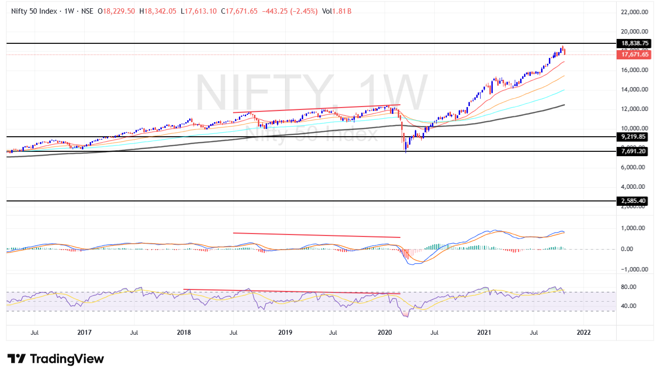
2020 – The Hidden Warning Before COVID Crash
Markets looked strong in late 2019–early 2020. Nifty was making new highs above 12,000, optimism was everywhere. But beneath the surface, charts were whispering something different – something big was about to happen.
The Special Catch – Double Divergence Theory
Price Action: Nifty made higher highs into early 2020.
MACD Divergence: MACD failed to confirm those highs and started making lower highs.
RSI Divergence: At the same time, RSI also made lower highs.
This created a rare pattern: Double Divergence (price up, but both momentum indicators down).
This was the smart money exit signal. While the crowd celebrated new highs, big players were quietly offloading positions.
The Lesson I Learnt:
That was the day I learnt one of the most powerful truths of technical analysis:
Divergences are warnings. Double Divergences are alarms.
Price may look strong on the surface, but momentum tells the real story.
COVID may have been the news trigger, but the charts had already shown the weakness.
For me, 2020 was not just about the crash. It was about discovering a special pattern – Double Divergence Theory – that changed the way I look at markets forever.
18-08-2025
2020 – The COVID Crash & the Mega Bull Run
Then came the pandemic. COVID-19 brought the world to a standstill. The stock market hit lower circuits, and panic ruled the streets.
But this time, I was prepared. The charts—RSI divergences, Supertrend breakdowns, trendlines—guided me. They showed me where fear was ending and where opportunity was beginning. While many were selling in panic, I positioned myself for the rebound.
The year 2020 shocked the world. COVID brought lockdowns, panic, and a historic market crash. Within weeks, Nifty collapsed from ~12,400 to ~7,500. Fear was everywhere. But once again, price action told the real story.
Price Action & Change of Polarity:
-
Old Resistance Became Support: The 7,500–7,800 zone was a major resistance in 2015–2016. When COVID panic struck, Nifty fell right back into this old zone – and it acted as a Change of Polarity Zone. Resistance turned into strong support.
-
Reversal Candles: At this zone, weekly charts printed long hammer candles with heavy wicks, showing massive absorption of selling.
-
RSI Bullish : While prices made fresh lows, RSI refused to make new lows – creating a bullish view that hinted downside momentum was fading.
-
MACD Flip: MACD, which had been in deep negative territory, started showing a flattening and crossover – early signs of momentum shifting back to the bulls.
-
Supertrend & EMA Recovery: Once Nifty reclaimed the 20-week EMA and the Supertrend flipped positive, the rally gained full speed.
-
Volume Confirmation: The rebound came with huge volumes, proving that smart money was accumulating when the crowd was panicking.
What It Taught Me
-
Fear creates opportunity: Maximum panic often aligns with long-term polarity zones – smart money buys when retail is selling.
-
Candles don’t lie: The hammer candles at support shouted accumulation, long before the news turned positive.
-
Trust polarity zones: Even during a global crisis, the market respected its old price history. That’s why support-resistance memory is the backbone of trading.
-
Patience pays: Those who trusted charts caught one of the fastest rebounds in history – Nifty doubled within a year from the COVID lows.
2020 reminded me that crashes don’t destroy markets – they reset them. And polarity zones are where new bull cycles are born.
18-08-2025
2022 – Russia–Ukraine War & Geopolitical Shock
The outbreak of the Russia–Ukraine war shook global markets. Commodities surged, crude spiked, and Gold once again became the ultimate safe haven. The charts told me the story before the headlines: resistance breakouts and volume surges clearly marked the path of the next rally.
Charts lesson: Ascending triangle breakouts in crude and bullish engulfing in Gold were clear signs of geopolitical premium. News came later—charts had already told the story.
18-08-2025
5-Year Market Cycles & A Fresh Boom Ahead
If there’s one thing experience has taught me, it’s this: markets move in cycles. Every 5 years, new themes, new leaders, and new opportunities emerge. After Lehman, after Modi’s triumph, after Trump’s trade wars, after COVID, and after the war shocks—each cycle has brought a fresh boom.Markets will never stop surprising us—Lehman, Modi, Trump, COVID, wars, policies… the list is endless. Every 5 years, markets rotate themes—2008 crash, 2013–14 elections, 2018, 2020 pandemic, 2022 war. Each cycle builds a fresh boom.
Charts, My True Companion:
From pandemic lows to record highs, technical analysis became my compass. Whether it was spotting a breakout on Nifty, a reversal in Gold, or trend continuation in Bank Nifty — the charts always gave me clarity when the world was full of noise.
The Truth That Changed My Life : "News creates panic. Charts create clarity."
From 2007 till today, my journey proves one thing—technical analysis turned my chaos into confidence, my doubts into discipline, and my trades into triumphs.
Events like Lehman, Modi’s victory, Trump’s era, COVID, or the Russia–Ukraine war—they shook the world. But every single time, the charts gave me the answers before the headlines.
That’s why today, I don’t just trade the news. I trade the charts. They turned my journey from chaos to confidence, and from survival to success.